The Power of Contrast in Landscape Design
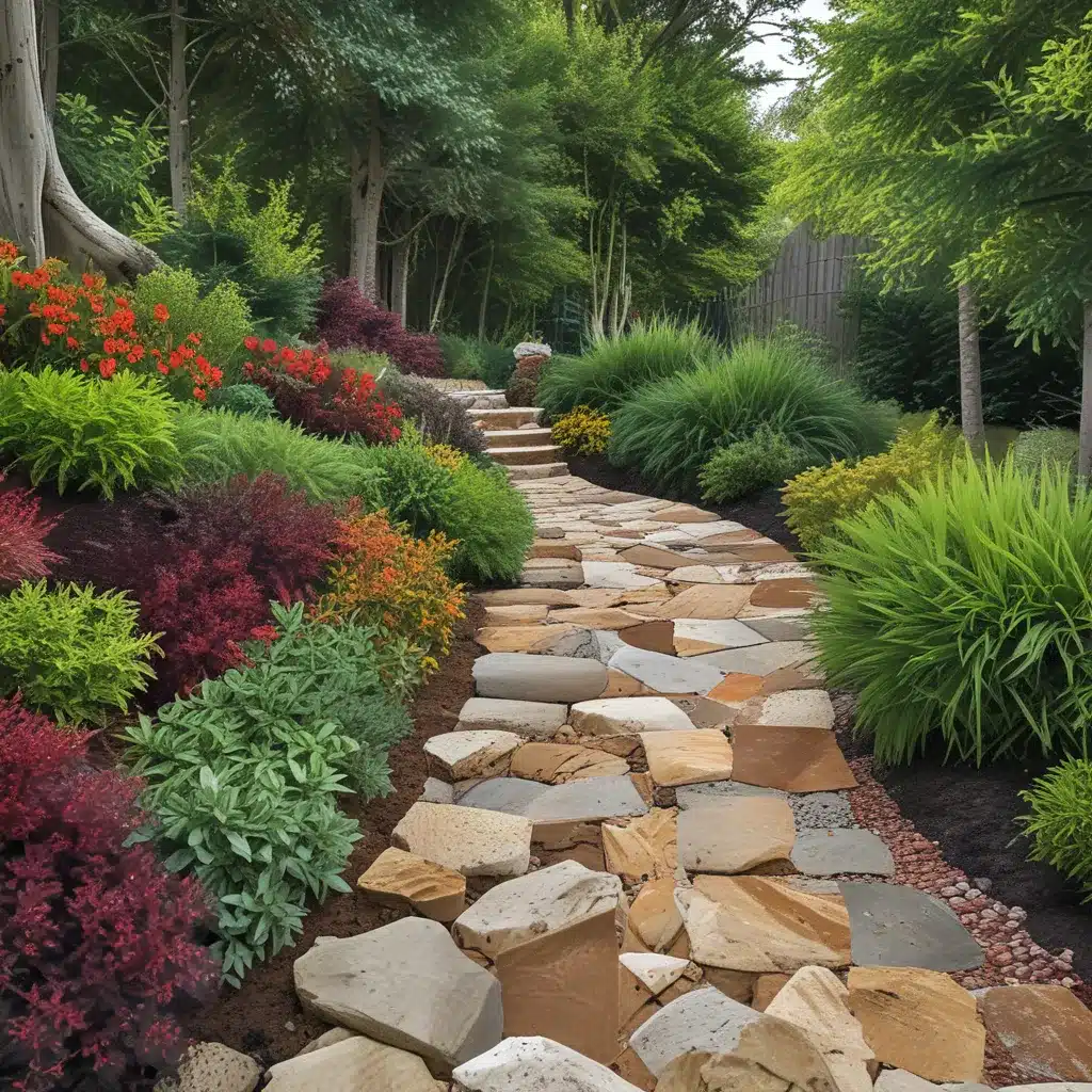
As a landscape designer, I’ve learned that the secret to creating visually striking outdoor spaces lies in the strategic use of contrasting colors and textures. It’s a principle that may seem simple on the surface, but when executed with intention, can transform a mundane yard into a true work of art.
In my years of experience working with clients in the Temecula, California area, I’ve seen firsthand how the juxtaposition of opposing elements can elevate a landscape design to new heights. Whether it’s pairing the bold, fiery hues of a Tecoma stans (Yellow Bells) with the delicate, lacy foliage of a Artemisia, or layering the rough, weathered texture of natural stone with the smooth, polished surfaces of concrete, the strategic use of contrast can elevate the visual interest of any outdoor space.
Embracing the Unexpected
One of my favorite things about working with contrasting elements is the element of surprise it can introduce. I love the moment when a client steps back and exclaims, “I never would have thought to put those two things together, but it works so beautifully!” It’s those unexpected pairings that truly capture the imagination and inspire a sense of wonder.
Take, for example, the way a Lantana with its vibrant, clustered blooms can complement the cool, calming hues of a Loropetalum shrub. Or how the delicate, arching stems of a Crape Myrtle can create a striking contrast against the bold, structural lines of a contemporary water feature. It’s these kinds of unexpected juxtapositions that keep a landscape design dynamic and engaging.
Balancing the Senses
But contrast isn’t just about visual impact; it’s also about engaging the senses. By pairing elements with different textures, you can create a landscape that invites touch and exploration. Imagine running your fingers along the smooth, velvety leaves of a Salvia Greggii and then contrasting that with the rough, weathered bark of a Juniper tree. Or the way the delicate, wispy fronds of a fern can softly brush against the sturdy, upright stems of a Mexican Oregano.
And let’s not forget the power of scent. By incorporating fragrant plants like Rosemary or Lavender into your landscape design, you can create a multisensory experience that engages the nose as well as the eyes and touch. It’s these layers of contrast that truly make a landscape design come alive.
Finding the Perfect Balance
Of course, the key to using contrast effectively is finding the right balance. You don’t want your landscape design to feel like a jarring clash of elements, but rather a harmonious interplay of opposing forces. That’s why it’s so important to carefully consider the scale, placement, and proportions of each component.
For example, you may want to use a bold, vibrant Pride of Barbados as a dramatic focal point, but balance it with the more delicate, feathery foliage of a Pentas or Indigo Spires Salvia. Or you may want to use a rugged, natural stone to anchor a landscape, but pair it with the sleek, modern lines of a A1 Landscape Construction water feature or patio.
It’s all about finding that perfect balance, where the contrasting elements work in harmony to create a visually stunning and deeply engaging outdoor space. And that’s the kind of landscape design that truly captivates the senses and inspires the imagination.
Embracing the Unexpected
One of the things I love most about working with contrasting elements is the sense of discovery and delight they can inspire. There’s something so satisfying about seeing a client’s eyes light up when they encounter an unexpected pairing that just works.
Take, for example, the way a Bi-color Iris can add a vibrant, cheerful pop of color against the more muted tones of a Verbena groundcover. Or the way the delicate, arching stems of a Japanese Quince can create a striking contrast against the bold, structural lines of a contemporary water feature.
It’s those unexpected juxtapositions that keep a landscape design dynamic and engaging, constantly inviting the viewer to explore and discover new delights. And as a designer, there’s nothing more rewarding than seeing that sense of wonder and delight on a client’s face.
Conclusion: Elevating the Ordinary to the Extraordinary
When it comes to landscape design, the strategic use of contrasting colors and textures is a powerful tool for elevating the ordinary to the extraordinary. By embracing the unexpected, balancing the senses, and finding the perfect harmony between opposing elements, you can create outdoor spaces that captivate the eye, engage the imagination, and leave a lasting impression.
So, whether you’re working with a small urban garden or a sprawling, rural estate, I encourage you to embrace the power of contrast and let your landscape design shine. After all, at the end of the day, isn’t that what we all want – to create outdoor spaces that are not just functional, but truly extraordinary?


